
Custom Packaging Solutions
Premium quality packaging tailored to your brand. From cosmetic boxes to luxury rigid packaging, we deliver excellence since 2010.

This is the title
Glossy vs Matte Photo Print: Which is Better for Packaging?
You're designing a box, but the glossy versus matte choice is stopping you. The wrong finish can make your product look cheap and ruin an otherwise perfect design.
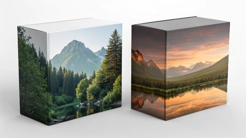
Glossy finishes1 make colors pop and grab attention with a reflective shine. Matte finishes2 offer a non-reflective, sophisticated look that feels luxurious. The best choice depends on your brand identity3 and the experience you want to create.

I've seen this debate play out thousands of times on the factory floor. A designer like Jacky will spend weeks perfecting a color palette, only to feel uncertain about the final finish. It’s not just about looks; it’s about touch and perception. Both finishes are created using different processes and give off completely different signals to your customer. Let's break down when to use each one so you can make the right choice every time.
Is it better to print matte or glossy on packaging?
You want your packaging colors4 to look amazing, but you're worried about the trade-offs. Glossy might be too flashy, while matte could look dull. Neither option feels perfect.
Neither is universally "better." Glossy is best for vibrant, high-contrast images5 that need to stand out. Matte is generally preferred for luxury products6, as it provides an elegant, high-end feel.

The choice between glossy and matte depends entirely on the customer's preference and the product's market. In our experience, the choice between a glossy or matte finish is completely up to the customer's preference. However, our market research7 has shown that customers prefer matte because it looks more high-end .
The Manufacturing Difference
The way we achieve these looks is a key part of the decision.
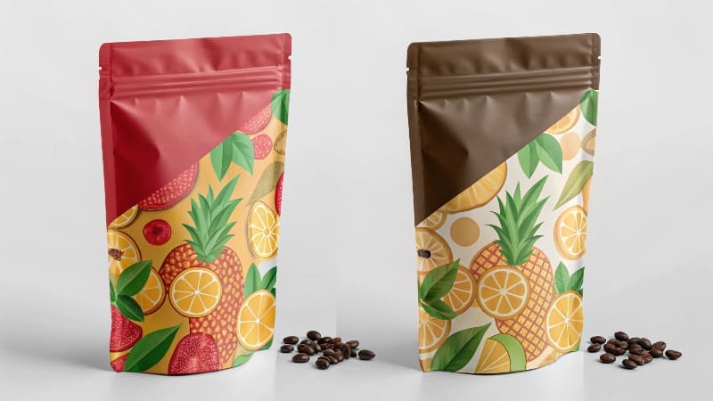
- Glossy: To get a glossy print, the paper surface feels shiny. We usually achieve this by using a UV machine to print and polish the surface . This UV coating8 creates a hard, protective, and highly reflective layer that makes colors appear very saturated and bright. It’s perfect for grabbing attention on a busy retail shelf.
- Matte: For a matte print, the paper surface feels dull. We typically achieve this by applying a surface treatment process called matte lamination9. This makes the colors look much more subdued . This thin film of plastic has a non-reflective, velvety texture that feels great to the touch and signals quiet luxury.
Do professional designers10 prefer matte or glossy?
You want to follow professional best practices, but you see major brands using both matte and glossy finishes. This makes it hard to know which is the "right" professional choice.
Professionals use both, but for high-end packaging11, the trend heavily favors matte. Our market research7 shows that customers perceive a matte finish as more premium and luxurious than a glossy one.

I work with professional designers10 every day. While there are no absolute rules, there are strong preferences based on the product category. The consensus is that matte feels more modern and sophisticated. A big reason for this is how a matte finish interacts with light and other design elements. It doesn’t create a harsh glare, which makes the package easier to photograph for e-commerce sites and social media. A matte surface also provides the perfect, subtle background for other, more dramatic finishes. For example, applying a spot gloss (a glossy UV coating8 on just one part of the design, like a logo) over a matte background creates a stunning contrast. The same is true for foil stamping; the shine of the foil looks much more dramatic and intentional against a non-reflective matte surface. This ability to layer textures and finishes makes matte a more versatile and sophisticated choice for many professional designers10.
What looks more professional, matte or glossy?
You want your brand to scream "professional." But choosing a finish based on your own taste feels risky. What if your customers see it as amateur or cheap?
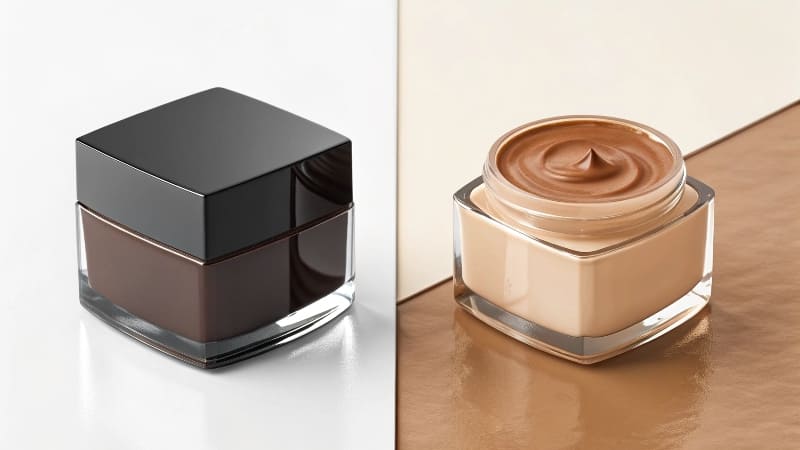
Matte is currently seen as more professional and sophisticated for most luxury and high-end goods. Glossy looks professional for products that need to convey energy, vibrance, and high-tech shine, like toys or electronics.

"Professional" is defined by your industry and your target customer. What looks professional for a children's toy (bright, shiny, exciting) would look completely unprofessional for a high-end skincare brand (calm, clean, elegant). I always advise clients to look at the leaders in their specific market. Walk through a store and see what the most successful brands are doing. You will see clear patterns emerge. Generally, the perception breaks down like this:
| Product Category | Dominant Professional Look | Why It Works |
|---|---|---|
| Cosmetics & Skincare | Matte | Signals cleanliness, sophistication, and scientific precision. |
| Jewelry & Luxury Goods | Matte | Creates a feeling of understated elegance and timeless value. |
| Electronics | Glossy | Mimics the shiny screens and plastic of the devices; feels modern and new. |
| Toys & Games | Glossy | Grabs children's attention; looks fun, durable, and vibrant. |
| Artisanal Foods | Matte | Feels natural, organic, and rustic; connects a product to the earth. |
Choosing the finish that aligns with customer expectations12 in your industry is the key to looking professional.
What are the cons of a matte finish?
Matte seems like the perfect choice for a high-end look. But you've heard it can make colors look muted and that the surface scuffs and scratches easily.
The main cons of a matte finish are that colors appear less vibrant and more muted. The surface can also be more prone to showing fingerprints, scuffs, and scratches than a glossy finish.
 "Disadvantages of a Matte Finish")
While matte is my preferred finish for premium packaging, it's important to be aware of its weaknesses. The two main drawbacks are color saturation13 and durability14. Because the matte lamination9 diffuses light instead of reflecting it, colors will always look less bright than they do on a glossy surface. Designers need to plan for this. They may need to slightly increase the saturation of their digital artwork to compensate for the muting effect of the matte finish.
The second issue is durability14. The soft-touch texture of a matte finish can be more susceptible to scuffs, scratches, and fingerprints, especially on dark colors like solid black or navy blue. A hard, slick UV gloss coating is much more resistant to this kind of wear and tear. However, we have solutions for this. We can use a special "anti-scuff" matte lamination9 that is much more durable than the standard option. It costs a little more, but for a luxury product, it is well worth the investment to ensure the package looks perfect when it reaches the customer.
Conclusion
Choosing between glossy and matte is a key branding decision. Glossy makes colors pop for retail, while matte provides a sophisticated, luxurious feel. The right choice elevates your product.
Explore how glossy finishes can enhance product visibility and attract customer attention. ↩
Learn why matte finishes are favored for luxury products and how they convey sophistication. ↩
Understand the importance of aligning packaging finishes with your brand's identity. ↩
Explore the psychology behind packaging colors and their effect on consumer choices. ↩
Discover how high-contrast images can make your packaging stand out on shelves. ↩
Find out which finishes elevate the perception of luxury in product packaging. ↩
See how market research can guide your choices in packaging finishes. ↩
Learn about UV coating and its role in creating glossy finishes for packaging. ↩
Explore the process of matte lamination and how it enhances packaging aesthetics. ↩
Gain insights into the preferences of professional designers regarding packaging finishes. ↩
Understand the elements that contribute to high-end packaging aesthetics. ↩
Understand the importance of meeting customer expectations in packaging choices. ↩
Learn about the impact of color saturation on the effectiveness of packaging. ↩
Discover how different finishes impact the durability of packaging over time. ↩
More to read
# Which is Better for Packaging Mockups: Laser or Inkjet?
Which is Better for Packaging Mockups: Laser or Inkjet? You need to create a physical
2025 year the most welcome packaging box color trends
This year, packaging trends are making a bold statement with Radiant Red taking the limelight
5 Important Things to Consider for Luxury Products Packaging?
5 Important Things to Consider for Luxury Products Packaging? You've created a premium product, but

